
Most of what you write on Instagram goes into captions, comments, Story text, and Notes. Those parts of the app move fast. A plain opening line often gets scrolled past before anyone reads it.
We made our IG fonts generator for exactly those fast moments. It gives you hundreds of styles you can copy in one tap, so your first line has a real chance of catching someone's eye.
We'll also point out the few spots where styled text doesn't behave the way you'd expect.
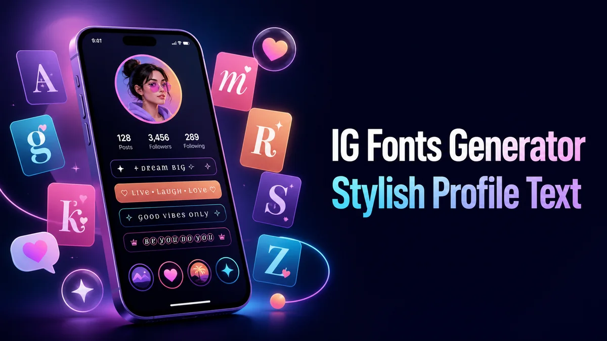
What Does an IG Fonts Generator Do?
An IG fonts generator turns plain words into Unicode characters that look like bold, script, gothic, or framed text. Instagram treats them as normal text, which is why they keep their shape when you paste.
Nothing needs installing, and no Instagram setting is involved. If you already styled your bio on our fonts for Instagram page, this page handles the next step, the text you post every day.
How Do You Style an Instagram Caption?
Style only the first line. Instagram shows roughly that much before the "more" link, and the rest of the caption reads better plain anyway.
- Type your opening line in the Your text box, short enough to fit before Instagram cuts it off.
- Tap Aesthetic styles for sparkles and soft frames, or type "bold" into Filter styles if you know what you want.
- Tap Copy on the card you like, and our tool sends the exact characters to your clipboard.
- Start a new post, paste the styled line at the top of the caption, and write the rest in plain text below it.
- Check the feed preview before you share, since a long styled line can wrap in a strange place on a small screen.
Where Do IG Fonts Work on Instagram?
Styled text works almost everywhere you type on Instagram. A few spots behave differently.
Captions and Comments
Captions hold up to 2,200 characters, and both captions and comments accept nearly every style here. Styled letters can count as two characters each. That only bites on very long styled captions.
Story Text
Paste styled text into the Story text tool, and Instagram still lets you pick one of its own Story fonts on top. The special letters keep their shape inside it, although bold and simple frames are the easiest to read over a busy photo with lots of color behind the words.
Hashtags and Mentions
Stay plain here. To Instagram, a styled hashtag is just text, so it won't link to the tag page or help anyone find your post.
Which IG Font Styles Work Best on a Small Screen?
Bold and small caps win on a phone. They stay sharp at caption size and show correctly on nearly every device.
Sparkle frames like ✧・゚ and soft stars suit lifestyle and aesthetic accounts. Gothic and heavy combinations look dramatic in a single word. In a full sentence, they turn into noise.
So pick one style per post and use it on one line. Your followers learn to spot your posts that way.
Related tools: Fonts for Instagram, Cool Instagram Bio Maker and Aesthetic Fonts Generator.
More tools like this one: Social Media Fonts.